Nothing New Magazine
Project Description
Design Problem: Design a thrifting magazine that will convince shoppers to use thrift stores rather than fast fashion brands. The magazine needs to be eye catching and trendy with a lot of colors and patterns as to catch the attention shoppers.
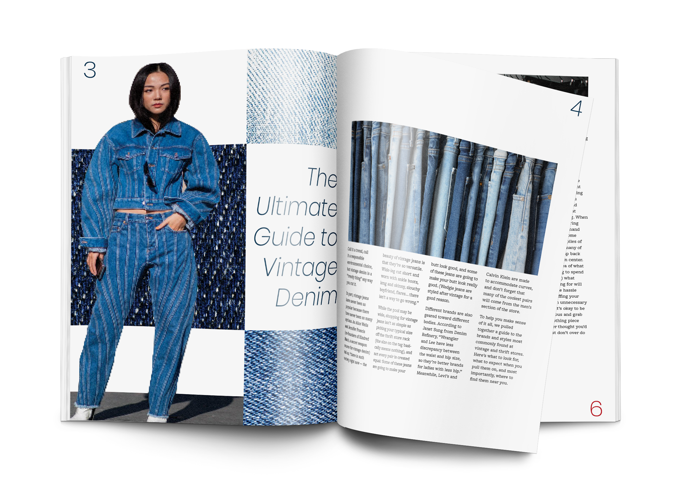
Design Process: I began by creating a masthead/logo for the magazine that reflected a vintage vibe but also something fun and light. I then researched thrift articles that I could use for my magazine and was pleased to find a lot of content for the subject. To display text in the magazine, I used a 4 column grid on each page with the typefaces, Poppins and Freight. I chose freight because for the body copy because it had a typewriting type look to reflect the vintage feel of the magazine. I created 3 more covers for the magazine to show that different fun colors can be used with the masthead.
Design Solution: The magazine captures a fun vintage feeling to interest readers in thrift fashion while so many are shopping at fast fashion brands. The bright and interesting imagery will keep the subject of the magazine light, while providing readers with articles that teach them how to be more sustainable with their fashion.